Friday, 9 June 2017

April 25th 2017

Meeting Deadlines

We amassed a production plan in time to pitch to our client.

Quality Management

We looked over our ideas to see if it would breach any legal and ethical regulations before negotiating the ideas with the client.

Meeting the client

We met with the client to discuss our ideas and our suggestions about the brief. He complied with our suggestions so we were both in agreement and he was happy with us to carry out our ideas in production.

Team-working

We all contributed to the pitch and managed to encompass the pitch criteria.

Tuesday 2nd May 2:15pm

Meeting Deadlines

There were a few errors with our production plan meaning that it was incomplete overall. It was incomplete because there wasn't enough information on the treatment in terms of consistency, tone, visual style, brand identity, and colour. Also, there were rough storyboards, and irrelevant designs, roles and responsibilities was also incomplete. I also stated that we were shooting outside for one of our idents which would have disastrous because stop-motion wouldn't work when there are cars would ruin the ident, therefore making it unfit for purpose.

Quality Management

Upon receiving the feedback from the client, I had to arrange a group meeting because there were faults with everyone's contribution towards the production plan so there was no one to blame but ourselves.  What was worse was the fact that Daniel S could think of a creative idea, so we had to sacrifice our break time to think of one more ident for Daniel S and I thought of the fashion show idea and gave it to him.

Team-working

As I have said before, each of us were a liability and we have accepted the blame and have improved the production plan. We also admit that we were not communicating enough.

Lawrence (Designs and Potential Problems and Possible Solutions)
Rosie (Treatment)
Daniel S (Production Budget)
James (Amendments to conditions)

3rd May 2017

Meeting Deadlines

After mending the production plan, we began forming our pre production after everyone chose their roles and we submitted our documentation before the deadline.

Rosie- Director
Lawrence- Assistant Director and Animator
Daniel S- Producer
James- Director of Photography and Editor

Team-working 

Everyone worked perfectly in reaching the goal of finishing their pre-production work without any arguments.

Quality Management

We assessed our own contribution to the work and made sure it was done to a good standard before submission.

10th May 2017

According to the feedback received, our overall pre-production is a solid merit. Everyone contributed to the documentation = so I was pleased to hear that.

15th May 2017

The production process was going fine since we filmed two of our idents with plenty of time to spare until we received the disparaging news that Daniel S lost the SD card which contained the footage of the two idents that we shot. All of us were annoyed at him because we weren't able to do anything for the following Monday which put us behind Schedule and when we had a lecture regarding our truancy, Daniel pretended to do something productive instead of taking the blame for losing the SD Card, so we didn't talk to him for a while.


16th May 2017

After a while, everyone calmed down and we decided to start again, so we decided to shoot the football Ident in the sports hall but Daniel S who was the producer didn't book out the sports hall because there were other people using the sports hall but we got lucky that they gave us half of the sports hall to shoot our ident. However I was still disappointed at the fact that he wasn't being very organised.

18th May 2017

After shooting out ident I asked Daniel if he booked out the hall for the fashion show and then he said that he was unable to due to exam season yet he said that he did book it and I was livid because he couldn't simply say he couldn't book the hall. So we shot the photography, hands, and the fashion show ident in the green room.

19th May 2017

Meeting Deadlines 

All idents done and ready for editing

Quality Management

We reviewed the footage and we agreed as a team that we were happy with it.

Team working

We managed to pull ourselves through the shooting stage so that we are all able to relax.

26th May 2017

Meeting Deadlines

We amassed a portfolio of previous work that was due in for the deadline on 26th May to deliver on weebly.

Quality Management 

We peer assessed our contribution to the work before submission.

Team-working

We were all successful in reaching the deadline.

8th June 2017

Meeting Deadlines

After the production process james edited and exported all the rough cuts to me so I can animate all four of them on photoshop. It was a long and painful process but I was still able to do it in due time.

Client Negotiation

According to the feedback I received from the client, I made one basic mistake in all of the idents which was the name of the channel which was just CTK which meant that it was advertising the college so I had to name the channel and the logo needs to last for at least three seconds for it to be considerable as an ident.  , I was still able to mend my idents so that they are ready by the delivery date.

Quality Management

I went over the idents I animated to ensure that the mistake cleverly pointed out by my client was corrected so I could deliver them on the delivery date.

Team-working

I did all the animations on my own because I had Adobe Photoshop and a pen tablet at home whereas my team members didn't to I took it upon myself to animate all four of these idents.
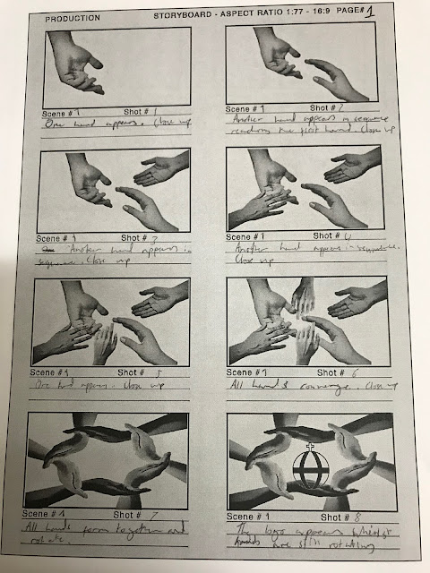

Wednesday, 17 May 2017

Task 2c

i) Identify Opportunities for Self-Development

In this team, I will be taking the role of assistant director. I have the opportunity to self develop my skills as an individual. I have to document the progress being made through the production schedule, inspecting the cast and the crew, using call sheets, health and safety on set, and ensuring the conditions are met in order to begin filming. I have to maintain being organised and maintain contact with the director.

ii) New skills

This gives me the opportunity to learn new skills such as learning to do stop-motion animation and rotoscoping since I have never learned these techniques before so I have learned these techniques through video tutorials on YouTube. During my experience with negotiating with the client we had to communicate with the client in order to understand how creative we can be whilst keeping to the client's demands.

iii) Multi-skilling

This gives me the opportunity to demonstrate multi-skilling. Which means that the role I am taking as an individual requires a variety of skills such as being organised which is essential. Communication is another one of the skills that is used mostly seeing as to how you need to manage the cast and keep in constant contact with the director. 

iv) Contribution to project brief

My contribution to the project brief is that I am the assistant director for the production of these idents and I will make sure that the conditions to film will be met and call sheets will be prepared in time with the schedule.

Monday, 8 May 2017

Tuesday, 2 May 2017

Production Diary

Production Diary 25th April 2017

We pitched our chosen theme for the suite of idents for the Christ The King YouTube channel. We covered the theme which was community and we discussed what is going to be within each ident and it was simple because we revised our ideas in the previous team meeting so that the four idents were similar to the theme we have chosen. We also handed the client the production plan which included the logo designs, budget, production schedule, potential problems and solutions. We had to pitch in under 5 mins so there was a considerable amount of pressure on our part but we covered everything else and our ideas were consistent.

Production Diary 26th April 2017

The next day after we pitched our ideas to the client, we received feedback from our client. We didn't know what to improve on because  there wasn't enough time for us to receive ours so we will be waiting for when he gives us feedback. In the meantime we are working on the pre-production for our  suite of idents due for the 3rd April.

Tuesday, 18 April 2017

Individual Pitch Idea

Easter work Production Plan Question 5 and 6


3(v)Potential Problems

One potential problem will be the budget because we might over spend which will disrupt the production therefore preventing us from fishing the project by the deadline. Another potential problem is that we might encounter is that we might have booked out faulty equipment which would lead to damaging the camera. The footage may not look professional due to our use of stop motion or the idea may not be strong enough to fulfil the brief.  The weather may be a potential threat because the rain would damage the camera. Another potential problem is that our idea may violate legal and ethical regulations.

3(vi)Potential Solutions

In retaliation to the budget problem, we will be using college equipment to shoot our product. To counter having faulty equipment, we will check the equipment that we booked and request a replacement in case we encounter it. In order to make the product better we will have to scrutinise the idea through test runs so that we get the concept and we will be able to know what to film and when to film it. In order to deal with the weather issue we will have to reschedule which would lead to overrunning. In retaliation to these regulatory constraints, we will go over our idea to ensure it doesn't offend any religions otherwise lawsuits will occur.

Monday, 17 April 2017

Easter Work Task 2b Reflective Article Question 1 and 2

2B(I)

We had a meeting with the client on Tuesday 30th march 2017 in order to discuss information regarding the brief that was set for us. It is important to consult with the client because by doing so, you will be able to know how creative you can be whilst keeping to the clients preferences. It is also important to consult with the client because that way you will be able to discuss the brief and the ideas within the brief. You will also be able to acquire information regarding what the client wants to see in the project. The client's name was David Pearson and we had to sit in our production teams to negotiate with the client in terms of what he wanted specifically and how creative we could be with these idents. We negotiated the fact that the idents could not be seasonal because there was no snow for winter, not enough sun for summer and no red leaves for autumn. So the client agreed that these idents don’t have to be seasonal anymore given the limitation.  Our second concern with the brief was the duration because we thought that it would be better if the duration could be shorter because our idents didn’t last as long as 30 seconds but our ideas were imaginative so therefore, we thought it would be a good idea to shorten the duration.


2B(II)

During the negotiation process, there is always a degree of discretion with the client which means how creative we can be as long as we take the client’s ideas and suggestions into account in other words, David Pearson stated that we didn’t have to use only white and purple in our idents we could use a variety of colours but he wants to keep the colour scheme of the logo. He also stated that he wanted stakeholders, students, and the parents to perceive the college as formal so that limited the extent of our creativity since most of our ideas were formal but they weren’t engaging enough to entertain the target audience and fulfil the brief. There must be a degree of discretion in terms of negotiating with the client because it will allow you think about what the client wants along with how creative you want to be. If we bypass the boundary of how much we can be creative, then there is too much discretion which will lead to the brief being unfulfilled. We must take the client's expectations into consideration whilst thinking about how creative we can be in creating this project.

Wednesday, 29 March 2017

Task 3A


This is the moodboard around the theme that I have chosen from my mind map. These images reflect on the theme, tone, and the brand identity. The theme I have chosen is freedom outside of the college environment. The tone for these idents are supposed to be cheerful, relieving and calming. The identity I hope to create with these idents is a sociable, enthusiastic, and a joyful identity.

Tuesday, 28 March 2017

Task 1D Annotationg the Ident Brief

How many idents need to be produced?

Four seasonal idents need to be produced and each of them must be approximately 30 seconds.

Who is your client?

David Pearson is our client.

When is the delivery date?

The delivery date is the 12th May 2017.

Who is the target audience?

Our target audience is 15-19 year old students of both genders from South-East London.

What does consistent mean in this context?

What consistent means in this context is that the four idents must have the same theme and they have to be similar in each ident.

Type of brief?

The brief is formal because it contains specific information on what the client would like us to do by the deadline set. It is also a negotiated brief because it also involves negotiating with the client if there are any concerns that need to be raised.

What media is the ident required to be produced?

The visual style of these four idents is either stop-motion or live action.

What do we mean by seasonal idents?

Four idents that reflect on the four seasons. A semiotic approach would  the sun representing summer ,  snow representing winter, orange or magenta leaves falling off trees would represent autumn, and spring would represent leaves falling off trees, and  the blue sky and the green grass.

What is the nature implicit of this brief?

The nature implicit of this brief is what you have to produce for the client (four seasonal idents with a duration of 30 seconds approx), the audience the product must cater to (15-19 year olds of both genders from South-East London) in order to satisfy the client, the expectations of the product, and the product itself.

What is the demand implicit of this brief?

The demand implicit of this brief are the restraints such as time which means how much time we have to produce and deliver these four suites of idents by the deadline which is the 12th May 2017. The budget we have to deal with production costs. Or budget is £50 which is from our own money.


Task 1B and 1C

Contractual


A contractual brief is a contract or brief made between the client and the employee. The brief includes the media company's requirements and their organisation of work. It also highlights the expectations of their client, price agreement, and payment terms.
.
Advantages

Contractual briefs can ensure that the client can work toward deadlines and deliver projects for when the client needs it. Also, contractual briefs are very specific and detailed ensuring that there is no confusion upon working towards the brief. It is also non-negotiable.

Disadvantages

A contractual brief is a binding contract meaning that once the contract has been signed, then you will be legally bound to the term and conditions. Failure to meet the client's expectations would result in legal action being taken towards the company which will result in the company's reputation being questioned.


Negotiated

As the name implies, the client and the employer will come to an agreement which will finalise the ideas of both the client and the employer. Both parties have to come to an agreement in order to seal the deal otherwise it will lead to disagreement which would cause problems.

Advantages

An advantage of this brief is that the client and the employer are free to express their ideas which is then combined so that it forms a brief that satisfies both the client and the employer. This ensures that there is no disagreement between both parties.

Disadvantages

Negotiations don't always go as planned as there will be some disagreements between both the employee and the client which will result in the loss of potential projects that the employer could have gained. The dissatisfied client will have to negotiate with another employer.

Formal


A formal brief is a document regarding detailed and concise information on what the client wants the company to achieve.

Advantages

An advantage of a formal brief is that it regards information about the task that the company need in order to complete and deliver.

Disadvantages

These types of brief do not legally bind the client. Therefore, if there are alterations that do not correspond to the brief then it will lead to negotiations being made between the company and the client

Informal

An informal brief is a brief that involves no signed agreement. Informal briefs usually consists of a verbal discussion between the client and the company about what the client wants the company to do.

Advantages

Seeing as to how there are no boundaries such as the time taken to complete and the deadline for when it needs to be delivered, it allows the client and the company to come up with more creative ideas and more time to finalize their choice on which idea would be more imaginative to follow up on.

Disadvantages

There is no written agreement stating the fee nor the deadline for when the project has to be delivered which would affect the outcome because though the ideas may be more creative given that there are no boundaries, the company and the client will keep changing their creative ideas and they will end up with nothing being produced.

Commission

A commission brief involves the hiring of an indie media company by a major media company to create the product for the major media company. In other words the indie media company is being commissioned to create the product by the major media company.

Advantages

The indie company will receive payment for the creation of the project and most likely receive a portion from the major media company's profit.

Disadvantages

The brief doesn't involve negotiations with only the client and the company. Instead, it is a negotiation between two companies meaning that a lot of ideas can be discussed and not all of them can be agreed upon between two parties, this will incite conflict between the two parties.

Tender

A tender brief consists or briefs containing the proposal about the project and the budget being produced and pitched by production companies to the client in need of the brief.

Advantages

The client would have a variety of briefs from production companies to select. This allows the client time to decide which brief would be suitable for him/her.

Disadvantages

One disadvantage is that so much time and decision making is taken towards the making of the brief and it is probable that it might not be chosen by the client.

Cooperative

A co-operative brief involves the completion of a task between a minimum of two companies hired by the client.

Advantages

This allows both companies to cooperate and discuss innovative ideas. In addition the two companies will be able to complete and the deliver the project before the deadline.

Disadvantages

There will most likely be disagreements between the two companies meaning that a negotiated brief will have to be distributed to both companies in for the purpose of appealing to both companies.

Competition

A competition brief is open to more than one company which gives the media company an opportunity to participate for the purpose of creating the best product, then the winner will be chosen by the client and will be rewarded prize money.


Advantages

Only the winning company gets the amount of money stated on the competition brief.

Disadvantages

After spending the companies budget and time towards the making of your project such as a film, you may not get chosen by the client.

Monday, 6 March 2017

Question 3&4

Each channel uses the same theme in their suite of idents for instance the theme BBC's suite of idents contain circles which represents the world. Also, it represents that Britian is one of the most multicultural places in the world. BBC creates brand loyalty through the concept of circles which represents the world and their idents involve people from different countries not just Britain which suggests that they are accepting of all races. Therefore, the viewers would respect their openness to different cultures and encourage them to watch their channel. BBC one's suite of idents is entertainment-led given the dogs running around in circles in a field and jumping over hurdles. In addition, there was no information being provided on screen nor was there a voice over, just logo being introduced at the end. 

Film 4's nostalgic theme has been consistent throughout the suite of idents. The only thing that changes in each ident is the location and those locations are similar to that of famous movies in the 1980's. What remains the same in each one is the digitally reinvented celluloid film strip transition to maintain their identity. Film 4 encourages brand loyalty because upon watching that ident the audience would develop the tendency to watch their channel more which would increase in viewing figures. Film 4 is information-led due to the voice over but the on screen visuals provide you with information of what will be aired next.

BBC Three creates brand loyalty given that their suite is consistently using circles compared to BBC One. However their concept is Threeworld which involves a much younger audience given the use of animation in their idents. The theme is consistent in their suite of idents and they have succeeded in creating brand loyalty because the idents reflect the company's identity and it has been done so well with the use of animation to entertain the viewers and that would want to make them watch BBC three. The visuals of the suite of idents make it an entertainment-led ident given the vibrant colour and the animation. however there is information being provided in the form of the voiceover but visuals are there to help the viewer relax whilst preparing them for whats coming up next.

Sky sports theme is consistent in their suite of idents and it is successful in creating brand loyalty because each of their idents contain live footage of football teams playing and other sports. This will encourage sports fans to watch their channel to see their favourite team play. It's like the ident is advertising their identity to the viewers which would convince them to go see the game live. Sky sports is entertainment led given that they are advertising sports using live footage to engage the viewers. However they only provide information on the upcoming matches but it still predominantly entertainment-led due to the transitions of one sport to another through mini screens.

Saturday, 11 February 2017

Task 3C Similarities and Differences

Yellow (Rosie) Pace
Red (James) Typography
Blue (Daniel S) Brand Identity
Black (Lawrence) Density of Information


Wednesday, 8 February 2017

Task 3B Analysis of Suite of Idents (Film 4)


Suite of Idents (Film 4)

A suite of idents is a collaboration of idents for one channel. Each individual ident has something in common such as Film 4's use of a celluloid transition in each ident and the setting in each one is familiar to films in the 80s or 90s. Through making a suite of idents you can maintain the theme, concept, and brand identity. In this report I will be analysing Film 4's suite of idents.

i. What the theme of the suite is

The theme of the suite of idents is historical throughout each suite of idents. The evidence as to why I think that may be is because of the transition of each individual ident is similar to a celluloid film strip. It is as if the ident itself is a mini film. Each Ident reflects the genre of the films that will be up next for instance, the corridor ident indicates that the next film is a horror film because of how similar it looks to The Shining.     

ii. How/why the theme appeals to the viewers (e.g. creating a particular tone to target a particular audience type)

 As I have mentioned before, the suite of idents are cinematic and they have decided to reinvent the classic celluloid film strip and integrate it with their idents so that it tells a mini story. These idents tease the audience into thinking that they are watching an actual film through a celluloid film strip. The Film 4 Idents appeal to an older audience and the reason why these idents appeal to an older audience is because they will be able to know what each film the suite of idents is referencing, for example, visuals for the corridor ident is referencing the movie The Shining which was made in the 1980's, the burning tyre in the gas station ident was referencing a movie called rubber.

iii. How they have used the same theme in different ways to create Brand Loyalty

A suite of idents is supposed to establish and maintain the continuity and present the brand identity. For example, throughout these idents what they all had in common was the movement which resembled that of a celluloid film strip and that symbolises the history of film making in the 1950s. This creates brand loyalty because the audience would be entertained by the visuals which would encourage them to watch their channel.

iv. Explain whether, how and why the idents are information-led or entertainment led

This ident is information-led because both the visuals are indicating the genre of the film that is coming up next and the name of the film. Though it may be predominantly information-led idents because of the voice over, it is still an entertaining ident to watch. So to conclude these suite of idents are both information and entertainment led.

v. Are the idents intended to be used at a particular time of day?

Only the gas station ident was intended to be used at night to enforce the watershed rule and indicate more adult films would be shown to the mature audience.

vi. Are idents intended to be used at a particular time of year?

These suite of idents aren’t used at a particular time of year given that there was no actual time on when these idents could be used.

vii. What does the suite convey about the channel's Brand Identity – what meaning?  

The suite of idents conveys a nostalgic brand identity through the celluloid film transition which is consistent throughout the suite of idents and through that transition, the red strips move in position to create the number four, which completes the logo. Also, what gives it a brand identity is the locations in each suite is that it is a reference to films that the audience may be familiar with. In other words, the suite is trying to communicate their brand identity across to the audience through the visuals which are similar to the movie that each ident is referring. 

viii. How effective the design of the suite is in communicating Visual information to a non-visual audience, appealing to a target audience; and the audience appreciating of desired tone

These idents aren't very affective in terms of communicating visual ideas to a non-visual audience because throughout these suite of idents I have already mentioned that it is a digital reinvention of a celluloid film strip which I think is the problem in terms of visual communication because the audience won't understand the artistic meaning behind it.  Film 4's idents are abstract because each one specifically the ones paying homage to horror films give off a different tone therefore the tone is inconsistent because they are appealing to both a children and an adult audience.

Ix. Assess - How effective the design of the suite is (Typography, Pace, Density of Information, Brand Identity)

Each ident is 30 seconds and the screen tempo moves very slowly but the pace increases but not fast enough that it is illusory to the audience. The screen tempo is symbolic because that was the moving image for celluloid film in the 1950’s. The four letter word ‘film’ is positioned in the middle and the they don't move until the screen tempo builds up which establishes the concept of stories being told through film strips. The Film 4 uses the colour red to brand their channel which is similar to BBC the colour is just on the boundary which is 255 and under otherwise it will distort the audio and the visuals. There is not much information on screen but instead there is a voice over providing the schedule. Whilst the visuals are there to entertain the audience. Overall, I think the design is effective because all the idents carry a consistent theme and each of them pay homage to classical films.

x. Duration of each Ident

The duration of each Ident is 30 seconds long. 


Wednesday, 1 February 2017

(1a)Timeline task

Our Timeline
https://www.tiki-toki.com/timeline/entry/762796/Sky-sports-Suite-of-Idents/

Class Timelines
https://www.tiki-toki.com/timeline/entry/774083/Disney-Channel-The-History-of-Idents/
https://www.tiki-toki.com/timeline/entry/762807/ITV-Ident/
http://jameswhite102.blogspot.co.uk/2017/01/timeline-film-4.html
https://www.tiki-toki.com/timeline/entry/771873/IDENT-TIMELINE-MTV/

(2b) Limitations of an Ident

Limitations

Typography

Typography is the aesthetics of an ident. In other words, how it looks in terms of font, colours, and size. Typography is a limitation because the logo has to be comprehensible otherwise the audience wouldn't know what they are watching. The typography also has to reflect the identity of the TV channel. The brightness must be balanced when using live footage or animations otherwise the on-screen visuals including the information would be incomprehensible meaning that the channel has failed to expose the channel's identity to the audience. In this BBC three ident, the logo is recognisable and all the colours are balanced meaning that the typography is successful in conveying the channel's identity. In addition, the brightness is balanced meaning that the audience can see the animation and aesthetics clearly.


Resolution

Resolution is also a limitation because when you zoom in on an ident, the audience can see each individual pixel. HD (1920x1080p) has become so dominant in idents that all the others are useless and undermined. Choosing the right resolution for the idents is also key. Ultra-high definition also known as 4k maybe crystal clear, but it reveals so much detail. So if an actress was in an ident wearing make-up such as mascara, the make-up would make no difference because creating an ultra-high definition ident would reveal the spots or freckles. Not everyone has expensive televisions so they are missing out on decent quality programming.


Colour

In an industry such as the BBC you would be working under a paid contract to produce an ident for their corporation and the colours your idents use have to be broadcast safe, meaning that the red green and blue thresholds have to be below 235 otherwise it will result in your Ident being returned to you to make those changes. There are some colours that cannot be broadcasted. For instance, the colour red because BBC have overused the colour red and when an audience sees another ident using the colour red then it will remind them of BBC one given that they overused that colour for years. In this example the colour which stands out the most is red and the colours have been balanced so that it doesn't distort the typography of the ident. Overall, colour is a limitation because the if the colours used in an ident are not broadcast safe, then the channel will end up with an oversaturated ident and the colours will also distort the audio which would lead to failure to expressing your brand identity to appeal to the target audience.


Size

The size of the ident and the logo is a limitation because it needs to have visibility to the audience and the logo needs to be correctly positioned and sized well enough so that the audience can view it on their tablets, computers, laptops and phones. In other words, the idents need to be resized to fit the screen resolution for portable devices. An example ident would be this TV3 ident. The size of the logo is huge but it doesn't cause any problems for viewers who own TV's with an aspect ratio of 16:9, but for viewers who can't keep up with technology lose the opportunity of experiencing high quality on-screen visuals. Size has now become a limitation because all the television channels compete with high definition 16:9 idents which is a predicament for viewers who are incapable of keeping up with technology.


Aspect Ratio

Aspect ratio is similar to the size of the screen. The reason as to why aspect ratio is a limitation towards producing and airing these idents is because not all viewers have TV's with an aspect ratio of 16:9 some may have lower like 4:3, this will force the ident maker to crop out the ident which would restrict the overall design of the ident. For instance, black bars which would make the ident look unprofessional. Trying to view and ident which hasn't been cropped out on a 4:3 screen would result in most of the ident being hidden and it will confuse the audience. For example this Ident has black bars on the sides meaning that the creativity is limited because not everything isn't being shown to the audience.


(2a)Opportunities of an Ident

Opportunities

Creation of Corporate Identity

Corporate identity is when a corporation present themselves to the consumers and investors through a suite of idents for the purpose of increasing the channel's reputation and potentially increasing revenue. The reason as to why creating a corporate identity through idents is an opportunity is because it will allow the audience to know what your corporation stands for and what content your channel provides. For instance the BBC in the 1950's used circles which represents the world, then they repackaged their idents meaning that they changed the concept to oneness which represents unity seeing as to how the UK is one of the most multi-cultural places on earth.


Branding of Content

Branding of content is a marketing opportunity which involves the use of information and entertainment used in the Ident so that it becomes information/entertainment-led Idents such as The Simpsons Ident on channel 4 where homer climbs up a tree to take a sip of his beer which was hanging from the transmission line and upon taking the sip he electrocutes himself and the camera zooms out showing the eagle eye view of Springfield and the channel 4 logo being introduced every time homer electrocutes himself that is entertaining and enjoyable to watch and it helps prepare them for the upcoming episode of The Simpsons.


Encourage Brand Loyalty

An Ident is only successful in encouraging brand loyalty only of the corporation has done their research on the audience they are trying to cater to. The ident has to make sense and show creativity and flair in so that it makes their desired audience watch only the channel. Most importantly it has to be memorable because it will remind them to tune in to watching the channel so that they can see the ident. An example would be the BBC ident involving Hippos swimming in a circle, consumers will remember the circle and the hippos and the formation they were swimming in, also not much red was seen in the ident but towards the end  the red fishes swam across the circle meaning that they are still holding on to the colour red. Encouraging brand loyalty is an opportunity


Appeal to target audience

This is an opportunity and it is similar to brand loyalty. Appealing to target audience is the first step towards encouraging brand loyalty. In order to appeal to the target audience, audience research must be conducted in order to see what the audience likes and what the channel can include in their ident to suit their preferences; This makes the ident successful. BBC has a more adult audience given their suite of circular idents. These idents weren't made to appeal to a teenage audience because there is slow motion being used and teenagers have a short attention span.


Creation of Tone

Creating a tone of the ident gives off the mood and the feelings you would have when you watch the ident. Upon creating the tone of the ident, the tone must match the tone of the programs broadcasted for public screening otherwise the ident wouldn't make sense and it would confuse the audience. For instance, having a channel that gives off an uplifting tone but the program which airs after the ident has an opposite feel to it wouldn't work. The Crime and Investigation Ident gives off a mysterious and suspenseful tone and that is associable to the programs they air.

Display of Text-Based Information

The display of text-based information is the ident providing you with information of what is coming up next during the end credits or after a series of adverts. Text-based information is displayed through a credit squeeze. An example of a credit squeeze being seen is from the end credits of a the TV show, The Apprentice from BBC One where the credits is split in half showing you what is coming up next on BBC two which is usually a follow up of The Apprentice with The Apprentice: You're Fired.


Tuesday, 31 January 2017

3a) Creative Ideas- Suite of Idents: Continuity, Theme,Tone, Brand Identity

Continuity of design

Through these three Idents, I think that we maintained the brand identity, theme, and concept of these Idents since they're all associable. For example, the logo was introduced in each ident, there was slow-motion in our suite of idents meaning tht the pace was slow. With the use of slow-motion, we were attempting to send a message to our viewers that you can reach your goal if you take it slowly and steadily.

Theme

The theme of our suite of idents was blood, sweat, and tears. However what made this ident unsuccessful in communicating ideas to our target audience is the fact that there was no blood and no tears in our suite of idents.

Tone

The tone that we tried to put across in each of these idents is a motivational and aspirational tone given that in each of our idents they all involved training, dedication, and exercise such as jogging, punching a punching bag, sit-ups, and taking a break. In my opinion, the ident of which I took a drink of water in was an original idea and I think that one stood out the most. I included that idea as one of our idents because we are telling the audience that it is important to take breaks after rigorous training.

Brand identity

When creating and presenting your brand identity it must be associable for the theme you chose to base your suite of idents on in order to match the theme. Our suite of idents didn't have any blood sweat, and tears meaning that the identity made it unclear. In my opinion, the theme was creative but there is also the limitation of getting these imaginative visual ideas to a non-visual audience meaning that they aren't as intellectual and they won't see the identity you have taken to brand your channel.

Appeal to target audience

With these Idents we were hoping to appeal to a masculine audience with an age range of 19-30. The reason as to why we chose this audience because teenagers aspire to be better than themselves however this ident may be speaking to an older audience because of the slow-motion effect because we already agreed on teenagers having a shorter attention span.

Purpose (Re-branding)

When we rebranded the channel, we didn't use any larger than life locations on purpose because this is ident involves training and hard work. We wanted to communicate with our audience telling them that all professional athletes, start from the bottom so the location we used was an ordinary street. Upon using that location it would be more effective in strengthening the continuity to make our suite appeal to the audience.


Suite of Idents - Sky Sports

Thursday, 26 January 2017

Timeline of idents

https://www.tiki-toki.com/timeline/entry/762796/Sky-sports-Suite-of-Idents/

Wednesday, 25 January 2017

(1b)Report on Purpose and Design of Idents

Purpose of Idents

An ident is short visual sequence of either animation or live footage.Television channels such as BBC, ITV, and Channel 4 use idents to brand themselves and create an identity for themselves and for the viewers to identify the channel.  Television idents visually communicate with viewers which will allow the viewers to identify their channel.. Idents are aired for 40 seconds going up to a minute and it is used to locate viewers to the channel. 

Channel's Identity and Branding

Branding can allow the consumers to identify the genre of the channel from looking at it. The channel creates an appealing ident in order to bring to the market and compete with other companies. It is important to have an strong ident that is successful in bringing out the channel's identity because a strong visual ident will increase the likeliness of increasing audience viewing and  the viewers would develop the tendency to continuously watch their channel. Therefore, a strong visual ident would lead to mass appeal and guaranteed brand loyalty. 


Horror Channel Ident

For example, this ident has dark colours and have a revealing logo. Darker colours like black or crimson create an eerie tone. For instance, this ident's use of colour creates a sense of unease and nervousness, this ident uses the colour red and black but the red is more dominant because it connotes blood. Another thing to mention about this ident is that it teases the audience and it makes them think that they are watching a movie but then at 0.13, the logo appears meaning that the 15 second film appears to be an Ident. The screen tempo was fast given the movement through the corridor, making the ident more engaging for the viewers because the movement through the red corridor gives off the impression that you are the victim fleeing from a killer.
Segmentation


Not all content being shown from a channel caters to all audiences so television companies undergo a process called segmentation which means the creation of different channels to cater to different audiences . A preferred TV channel needs to have a segmented audience which can be targeted and identified within the cost, effort and time. Segmentation is used solely for the purpose of appealing to a wide range of audiences which would mean a lot of audience research would have to be conducted in order for the strategy to be effective otherwise it will result in having various channels with hardly any viewers because no research was done on what they prefer to see on-screen. An example of segmentation is the BBC. These are the range of channels they have now after audience segmentation now they have each channel for each specific audience.
Segmentation within scheduling


Segmentation within scheduling is achieved when the ident is able to simultaneously inform the audience regarding upcoming TV shows and entertain them with already existing tv shows or cartoons such as Family Guy for the purpose of letting the viewers know that the Family Guy is coming up next. This ident is information-led but you are also being entertained by programmes that are aired on this channel. In this particular ident, there is information on-screen informing the viewers that Family Guy will be coming up next. 


Scheduling


Scheduling is used to indicate when particular programmes will be broadcasted on television. In other words, it is used to enforce watershed which means all the adult shows are broadcasted at 9pm and idents can be used as an indication for when the adult shows will be shown. An example ident which enforces the watershed rule is the channel 4 Tokyo ident. What I found creative about this particular channel 4 Ident is that they used the cityscape of Tokyo for the enforcement of watershed and the use of this particular footage was effective because the visuals of the cityscape is visually appealing in real life and in this ident. This channel 4 logo in the tokyo ident is positioned in the center. The logo is revealed through blocks of light as the camera moves. The logo is fully revealed at 0.37 and then it breaks up again as the camera moves away. This is called a reveal ident. 

Entertainment-led


This E4 ident is entertainment-led given the use of stop motion animation to appeal to a younger audience. Also the design of the ident creates a happy tone which is bright, fun and exciting. Idents like this can interact with the audience because this ident is shown during the day and it creates a link between the time of day it is and when this ident airs. This ident includes screen tempo. The reason as to why screen tempo is quite fast in this particular ident is so that they can appeal to a young target audience and young people have a short-attention span so therefore increasing the pace of an ident will make it more engaging. The colour purple is dominant in this particular ident because this ident is telling the audience that the colour purple is their identity and the colour purple. It is seen at 0.07 when the colour purple starts taking over the two sheds. 


Marketing


One of the purposes of an ident is to market the channel. The channel needs to create a brand identity in order to do so. If an Ident appeals to its target audience then the channel has done their market research. The visuals should revolve around their target audience. This star wars Ident is a prime example of marketing. There is synergy being displayed in this ident. Sky cinema airs blockbuster films and Star Wars is a blockbuster film. In this ident, there is synergy going on between Sky and Disney. Sky is using the Star wars franchise in order get the audience for Star wars. Sky have bought the rights to star wars from Disney so therefore, they can advertise it to the audience.
Packaging and Re-Packaging


Packaging and re-packaging is the evolution of redesigning idents from the same channel whilst keeping the theme and corporate identity intact but with a different brand identity and different designs to appeal to audiences. An example of where re-packaging has occurred is the BBC one ident where they changed the concept from circles to oneness. Oneness represents diversity within the nation. 


Re-branding a channel


This process involves altering the channel's image of a TV channel. Rebranding a channel gives the channel a new look and feel. Channels are re-branded so that it can keep up with time. In other words, giving the channel a more modern or contemporary look. An example channel of where they used rebranding is ITV. This was the old logo. The design of this ident was used to interact with viewers using a gimmick which is a game of snakes and ladders but with scaffolding and builders. The ident is inviting the viewers to play snakes and ladders with the builders.


This is the current ITV logo after the rebranding process. In comparison to the old ident this one is more dynamic and colourful. The reason as to why they rebranded their channel is so that they could encourage younger viewers to tune in and watch their channel. The colours of the flag are identical with the logo given that it is positioned on the left side. The logo is camouflaged in the flag making it look invisible to the viewers. This could also be another reveal ident. The tempo is quite slow but the visuals are appealing and it creates a relaxing tone. This ident is also promoting and supporting the LGBT community.

Monday, 9 January 2017

Prep work

Task 1

Channel's Identity and Branding

A channel's Identity or brand is interpreted by the consumers. consumers can synergize with brands. This can be done by identifying the design, or logo of the ident. The channel's brand and identity is formed of characteristics that establish the channel. For example, an ident for a horror film would have dark colours and have a revealing logo. Darker colours like black or crimson create a sense of unease and nervousness. Branding can allow the consumers to identify the genre of the channel from looking at it. The company creates an appealing ident in order to bring to the market and compete with other companies. A strong visual ident wll increase the likeliness of increasing the audience.

Brand Loyalty

Brand loyalty a promise that is unspoken; it involves the purchase of a product or service made by the consumer. Brand loyalty is also a pattern of consumer behaviour where consumers become committed to a particular brand and consistently purchase from the same brand over time. Loyal customers will purchase products from brands regardless of how expensive the product or service is. Brand loyalty for television branding means a growth in audience as there would be more loyal customers being drawn towards the product.

Segmentation

Segmentation is the process of dividing the areas of marketing in order to find the audience suitable for their product or service. Not all content being shown from a channel caters to all audiences. A preferred TV channel needs to have a segmented audience which can be targeted and identified within the cost, effort and time. Breaks in between channels for advertising.

Re-branding a channel

This process involves altering the channel's image of  a TV channel. Rebranding a channel gives the channel a new look and feel. Channels are re-branded so that it can keep up with time. In other words, giving the channel a more modern or contemporary look.

Task 2

Crime Investigation Ident


This Ident features a crime scene taking place at night and a detective examining the area and then the logo is then revealed. The colours involved are red, black, these dark colours reinforce the dark mise-en-scene for instance the logo blending in with the low-key lighting. This ident connotes mystery and suspense. this ident can easily communicate the audience and make it recognizable as a channel for murder mysteries. This ident gives the channel a gloomy look and feel in the eyes of the audience. This channel covers crime stories where the fact is darker than fiction.

Cartoon Network


This is the old cartoon network ident. It is simply involves two characters black and red duplicating until there is enough that it reveals the logo to the audience. This is also known as a reveal ident. The color scheme matches logo. The animation appeals to the younger audience more than the colours because animations in general are visually enjoyable and it is easier to communicate with your audience and it also saves them time.

Sky Movies Ident


This Ident involves a pan left showing the sky movies channels until it stops at the one that you are currently watching and then the logo appears. The soundtrack sets your mind at ease and it prepares you for the programming. In other words, it is locating the viewer to the channel. The colour of the logo doesn't blend with the typography of the ident. This is probably because the visuals are more appealing.

BBC


This ident involves a hippo looking at a camera and then swims underwater to join the other hippos and then a circle is formed around the hippos and then the logo appears. This ident is preparing the viewer for the programming by using footage of hippos. The mood of this ident is relaxing since hippos are peaceful and harmless animals.

Channel four


This one is a reveal ident where there are buildings which are used to reveal the logo when the camera pans into place. Space and time is being distorted in this ident which is a unique and an interesting idea. The logo is positioned in the middle of the ident because the logo is dominant. The soundtrack is questionable because it seems like a 40 second music video but the visuals overpower the music.


Task 3